The Unseen Depths: How *Amanchu!* Inherited the Luminous Legacy of *Aria* and Mastered the Iyashikei Genre
8 months ago
Share this news:
Often recognized simply as a comforting slice-of-life series, J.C.STAFF’s 2016 anime adaptation of Kozue Amano’s beloved manga, Amanchu!, is considerably more than a heartwarming story about high school students discovering scuba diving. This production stands as a meticulously crafted example of the ‘Iyashikei’ (healing) genre, rich with fascinating production details and a profound, spiritual lineage tracing back to Amano’s earlier seminal work, Aria. Uncovering these deeper layers reveals the impressive scope of the creator’s vision and the dedication of the animation team.
The Continuation of the Aria Philosophy
The single most critical piece of context for Amanchu! is its intentional continuation of the Aria philosophy. While Aria immersed audiences in the fantastical, water-logged canals of Neo-Venice on Mars (Aqua), Amanchu! anchors its narrative firmly in reality, utilizing the stunning, tangible beauty of Japan’s Izu Peninsula. Despite the shift in locale, the core thematic DNA remains perfectly preserved: atmospheric immersion, a gently meditative pace, profound explorations of burgeoning friendship, and an unwavering appreciation for the quiet moments of daily life.
This seamless transition was guaranteed by the directorial continuity. Junichi Sato, the legendary chief director responsible for the entire Aria anime franchise, also helmed Amanchu!. Sato’s consistent involvement ensured that the characteristic slow, emotionally sincere rhythm cherished by Amano’s long-time followers was flawlessly translated into this new, underwater world.
Commitment to Geographical Authenticity
Furthermore, the series gains immense depth from its hyper-specific geographical setting. Amanchu! is uniquely celebrated for its precise and affectionate depiction of the real town of Itō in Shizuoka Prefecture. Amano’s reputation for rigorous research shines through, as landmarks, coastal vistas, and even the interior ambiance of the local diving shop, Grand Blue, are faithful renderings of genuine locations. This commitment to tangible reality transforms the anime into an evocative travel guide, allowing fans who visit the Izu Peninsula to instantly recognize the winding streets and specific ocean views.

The production team invested heavily in location scouting, ensuring that the background art’s visual authenticity reinforces the story’s calming, immersive power.
The Dynamic Visual Style and Technical Depth
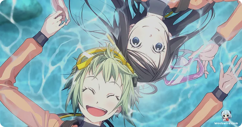
Visually, the series employs a surprising and distinctive stylistic choice inherited from Amano’s previous catalog: sudden, exaggerated chibi character deformations. Affectionately dubbed ‘Pikari faces’ by fans, these comedic expressions provide a jarring, yet deliberate, contrast to the otherwise lush, realistic, and detailed background art. Used as a potent visual shorthand, these distortions emphasize moments of extreme, innocent emotion—pure joy, utter confusion, or surprise—preventing the narrative from ever becoming overly sentimental. This dynamic interplay between the serene Izu environment and the explosive visual comedy is a signature trademark, capturing the sometimes awkward, yet always exuberant, energy of high school life.
Finally, the technical accuracy of the scuba diving sequences, complete with real terminology and safety protocols, elevates the series, merging genuine educational elements with a heartfelt tribute to the natural world and the journey of self-discovery found beneath the waves.